How to Document a Data Pipeline
This is my very first guest blog, contributed by Jared Rand.
Data pipelines often grow into circuitous, undocumented messes over time. In this article, learn how to document your data pipelines and save your team from future headaches.
Do Data Pipelines Really Need Documentation?
Most data scientists learn to document their code early in their careers. And surely, well-documented code can go a long way in communicating how a data pipeline functions. But many data scientists do not explicitly document the steps in a pipeline and how data flows through them. Here are some things that could happen if you don’t document your data pipeline.
- No one on the team understands how it all fits together. With each addition to the pipeline, it grows more convoluted.
- No one keeps track of what gets used by downstream consumers. With each addition to the pipeline, your outputs get more bloated.
Popular Approaches to Data Pipeline Documentation
Data pipelines are often depicted as a directed acyclic graph (DAG). Each step in the pipeline is a node in the graph and edges represent data flowing from one step to the next. The resulting graph is directed (data flows from one step to the next) and acyclic (the output of a step should never flow back around to become its own input).
 Image credit – Basic example of a DAG
Common Tools Used by Data Engineers for Documentation
Many popular packages for running data pipelines provide visualizations of your pipeline’s DAG within a management console. This is true for Spark, Airflow, and others.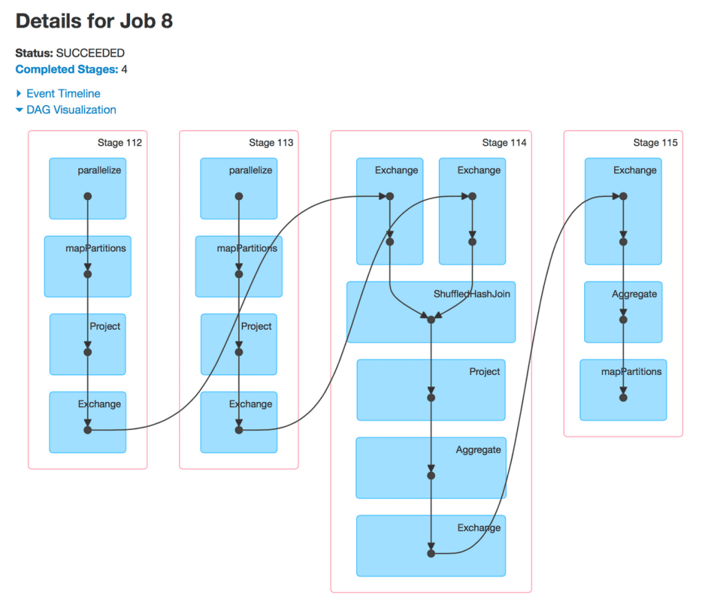 Image credit – Spark DAG visualization
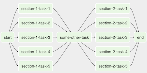 Image credit – Apache Airflow DAG visualization
If you’re not using one of these frameworks, you can manually create your own DAG visualizations with a tool such as Graphviz.
Example: Visualizing Your Data Pipeline Using Graphviz
Graphviz is an open source graph visualization program. To create an image of your pipeline, you can either create a text file that specifies the nodes and edges, or use the graphviz python package. Here are a couple data pipeline visualizations I made with graphviz. I made one as an example of a terrible data pipeline that resembles something I’ve seen in real life. I made another as an example of what I thought was a good pipeline. Alisa points out in her guest post on Skillenai that my “good” pipeline is far from perfect.Worst Data Pipeline Ever
First, here is the text file I made as an input to Graphviz.
digraph worst_data_pipeline {

  //setup
  compound = True;
  splines = True;

  // inputs in red
  campaigns_raw [color = red]
  views_raw [color = red]
  visitors_raw [color = red]

  // outputs in blue
  acquisition_report [color = blue]

  // intermediates in green
  past_visitors [color = green]
  past_acquisition [color = green]

  // subgraphs
  subgraph etl {
    label = "etl";

    subgraph prep_traffic {
      label = "prep_traffic"

      // get new vs returning visitors
      views_raw -> views_today [label="get_views_today"]
      {views_today, past_visitors} -> new_visitors [label="todays_new_visitors"]
      {new_visitors, past_visitors, views_today} -> visitors_processed [label="new_vs_returning"]
      {visitors_raw, new_visitors} -> past_visitors [label="update_past_visitors"]

    }

    subgraph acquisition_report {
      {campaigns_raw, views_today, visitors_processed} -> acquisition_today [label="get_acquisition_today"]
      {past_acquisition, acquisition_today} -> acquisition_report [label="get_acquisition_report"]
      {past_acquisition, acquisition_today} -> past_acquisition [label="update_past_acquisition"]

    }

  }

}
And here is the resulting image of the data pipeline.
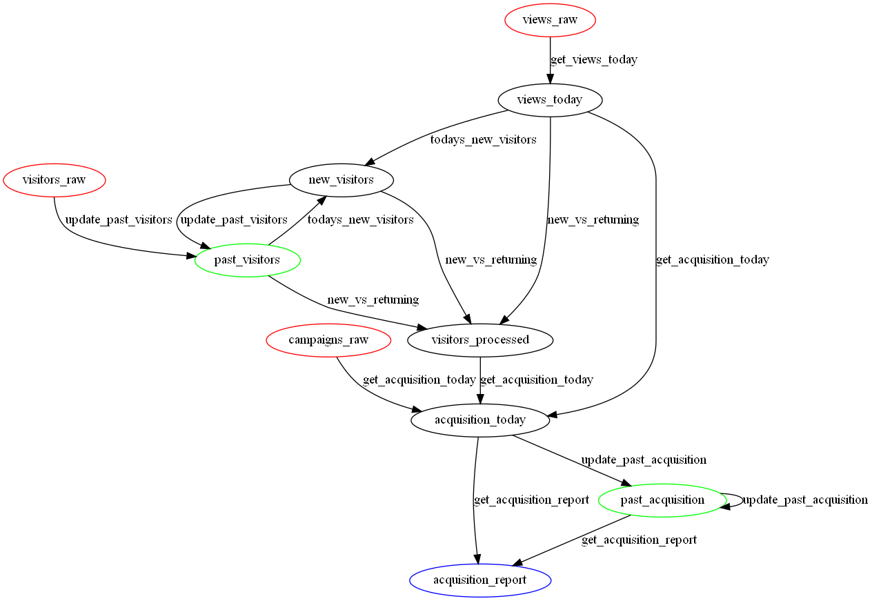 Image credit – Worst data pipeline ever
Better Data Pipeline
Again, here is the text file.
digraph best_data_pipeline {

  //setup
  compound = True;
  splines = True;

  // inputs in red
  campaigns_raw [color = red]
  views_raw [color = red]
  visitors_raw [color = red]
  signups_raw [color = red]
  sales_raw [color = red]

  // outputs in blue
  acquisition_report [color = blue]
  funnel_report [color = blue]
  customer_profiles [color = blue]

  // subgraphs
  subgraph etl {
    label = "etl";

    subgraph extract {
      label = "extract"

      // extract columns and rows you need
      campaigns_raw -> campaigns_slice [label="extract_from_source"]
      views_raw -> views_slice [label="extract_from_source"]
      visitors_raw -> visitors_slice [label="extract_from_source"]
      signups_raw -> signups_slice [label="extract_from_source"]
      sales_raw -> sales_slice [label="extract_from_source"]

      // cast types and standardize nulls
      campaigns_slice -> campaigns [label="clean"]
      views_slice -> views [label="clean"]
      visitors_slice -> visitors [label="clean"]
      signups_slice -> signups [label="clean"]
      sales_slice -> sales [label="clean"]

    }

    subgraph transform {
      label = "transform"

      // run core business logic
      {campaigns, views, visitors} -> acquisition_report_local [label="acquisition_report_job"]
      {views, signups, sales} -> funnel_report_local [label="funnel_report_job"]
      {signups, sales} -> customer_profiles_local [label="customer_profiles_job"]

    }

    subgraph load {
      label = "load"

      // load results into final data store
      acquisition_report_local -> acquisition_report [label="load_to_data_store"]
      funnel_report_local -> funnel_report [label="load_to_data_store"]
      customer_profiles_local -> customer_profiles [label="load_to_data_store"]

    }

  }

}
And here is the image.
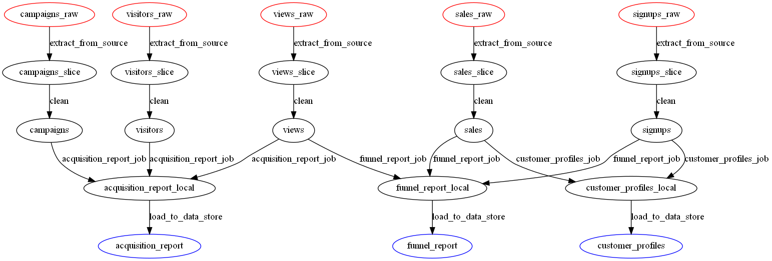 Image credit – A better data pipeline
 Jared Rand is a data scientist specializing in natural language processing. He also has an MBA and is a serial entrepreneur. He is the founder of https://skillenai.com/ and blogs at https://jrandblog.com/.